Written by
Jane Fitzgerald who writes for
Glass Tile Warehouse
Tile surfaces add a texture and a permanence that other surfaces simply
cannot achieve, but it’s important to find a color and pattern than match the
space. These five applications select mosaic tiles that make good use of light
and texture to create looks that are balanced, vibrant and timeless.
Mixed Blue Sheen
More than one
decent bathroom has been ruined by the misapplication of blue tiles to a large
wall. But the mixture of this blue and turquoise mosaic shimmers in the strong
light of this bathroom’s big window. The large dark vanity also helps to
balance the glimmer of the mosaic shimmer, grounding it with hard lines and a
dark wood finish. When you work with such vibrant mosaic patterns, it’s
important not to make the rest of the space too busy, and this space strikes a
good balance.
Blue Glass Tile Table
It’s always
nice to see tile surfaces show up where you don’t expect them. This steel table
frames the electric blue of the glass tiles beautifully, and the choice of
green accessories helps pull off a complementary color balance that could
easily have wound up looking dated. Here, it simply looks expertly arranged.
Without the accessories, the mosaic pattern might look bare and unfinished,
which just shows you that a mosaic pattern alone may not complete a space.
Rough Stone Veneer
Too often,
the neutral tones of stone mosaics like this are relegated to the background
with a centerpiece mirror. Here, the mirror is excluded above the vanity and
the rough, chunky stone surface takes center stage. The single-handle antique
brass faucet emerges from the mosaic almost as if it’s been there for a
century. If not for the small contemporary size of the tiles, you could swear
they were aged as well. The modernity of the design is subtle, allowing the
texture of the rough-cut tile to dominate the space.
Wavy Glass Mosaic
A good way to
shake up traditional expectations is to play with lines, and this installation
definitely does that. The sharpness of the vertical lines is cutely disrupted
by the wavy horizontal curves. The curves are echoed in the glass candlesticks
and the paisley curves of the wall tile. All of it scatters light, mixing
transparency and opacity. Whether natural or artificial light, it all looks
clean in the slightly dirty-white tiles.
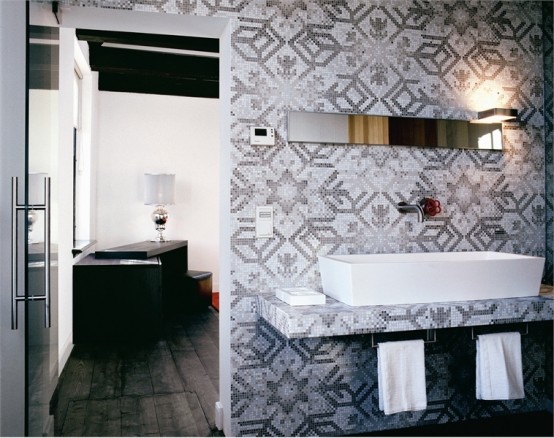
Wood on Grayscale
In a time
when bold colors are in vogue, it’s nice to see an understated grayscale tile
in play. A rich wood grain will warm up the coolness of the gray, while the
boxy mosaic structure mixes with the organic chaos of the tile mixture. The
straight lines of the contemporary cabinetry play off the pixilated gray tiles
in a way that more traditional cabinets would not.
Image credits:
·
Stone
tile: besthousedesign.com
·
Wavy-glass-tiles
interiordesign-newyork.com
·
Blue
glass tile tishflooring.com
·
Blue-tile-table
usarchitecture.com
·
Grayscale-tile
atlantalegacyhomes.blogspot.com

